Posts

The Finale

Image
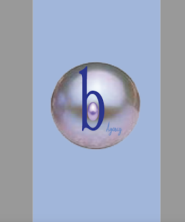
A business card demonstrates professionalism and the seriousness of one’s company. This is what B’s business card was meant to represent. The amplified pearl from the logo keeps the message of pressure creating gems. Unlike many other business cards in the class, this one has a back. This choice was made to avoid cluster due to knowing the vision of the large pearl. This postcard was formatted based on a magazine layout. The “celebrity” or featured person in the corner with their name in large letters in a visually appealing graphic design that catches the eye. Being that the goal is to one day do public relations for a magazine, this made sense. By far the most difficult and stressful assignment of the semester. This little boy was the main character in every night nightmares for over a few weeks. Obviously, he came out great but this really showed that dreams can come true and but it takes a lot of work. This is a dream come true. At the beginning of 2018, creating a log

All About Me!

Image
This postcard literally sells a person. The picture of a person, their bio, and personalized design elements to it. This is the most personalized type of professional graphic that can be made. A boss would be incredibly impressed with something such as this when combined with other examples of work, especially in the graphic design and public relations field. As a stand-alone bio, this may come off a little too confident or cocky as some may say but when combined with a strong resume and impressive interview, this just may be the cherry that tops off the secured job or career path. The skills that go into the creation of this project are very prominent requirements for future employers. The writing and editing skills that go into the coming of the bio itself can be like no other. Then the skills used to create the layout such as picture placement and text wrap can help in the graphic design field. This shows the understanding of a design layout, knowing the design rules and which rules

Logo Power

Image
Let’s take it back to the ‘90s. Orange soda was all the rage. Come on, being a baby didn’t stop Kenan and Kel from being one of the favorites. Fanta soda is the visualization of that and the logo definitely says that. Fanta is especially world-renowned for that very orange soda, so the fact that the logo has an orange in it is exceptional. This keeps people remembering what makes the company. The fun font is also a plus. Soda has so many names like pop for example. The font used in this logo definitely shows that. It sure pops. One thing professors talk about when teaching logos, is that FedEx and the example logo. The visuals are both straight-forward while having some underlying themes. FedEx is all about having fast shipping so having that arrow within the letters gets the point across without realizing it. This is a logo that creators thought long and hard about. They understood that symbols and logos can get through to people without people realizing it. It’s like the theory

The Actor's Takeover

Twiggy Who? There are surely Twiggy vibes with this magazine excerpt.  Let’s be honest, the sixties star, Twiggy had to have been the inspiration for this excerpt. The headline of the story is headlined by a huge, curvalicious letter “S”, that one may even say is as sharp is Twiggy’s famous winged eyeliner. The article itself contrasts the curvy font of the “S”. The contrast makes the page pleasing to the human eye. If it were all the same font and structure, it would be monotonous to the human eye. There is also complementary formatting done with the quote above the headline. The quote is bolded just like the headline which gives the page repetition. The repetition eases our brain that naturally looks for things to be repeated more than twice. On this page you can find the bolded concept in the headline, quote above it and the line that points out Emma Watson’s name. There you have three uses of one formatting concept. Ideally, that alone gives this piece points towards to high de

Communication is Power

Communication is said to be as fluid as a stream of water. It can come in several different shapes and forms for the thousands of different types of people that use it. Some of the basics include visual, written, auditory, and verbal communication. There are even cases where you can identify with more than one form of communication. Then, even if you identify with more than one form, you may still connect to one more than the others. One thing that needs to be understood is that, each person is different. There is no specific way that one should communication. There is beauty in it, honestly. Visual communication is a form that numerous people find they respond to the best, especially when combined with auditory communication. It connects to people because they are able to see and hear something being explained. That way if they do not understand something visually then they can rely on the auditory version to help them and vice versa. A good example of this is when your mom is callin